
2024
SaaS Dashboard
SaaS
dashboard
Redesigning a Data-Heavy Cybersecurity Dashboard into a Visual, Decision-Driven Interface for Technical and Non-Technical Business Users
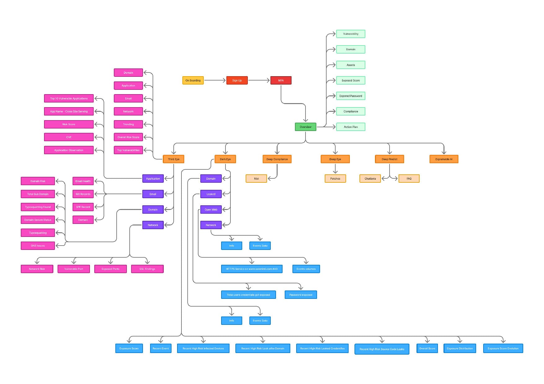
This project involved the end-to-end design of a cybersecurity dashboard for Pinochle, focused on translating technical threat data into a human-friendly visual format. My goal was to transform complex, jargon-heavy information into an intuitive interface that enables faster decision-making. Leveraging design systems, accessibility principles, and modular layouts, I simplified navigation and prioritized key insights—turning a previously cluttered interface into a sleek, responsive, and impactful digital experience that empowered both C-level executives and security analysts.
Concept & Objective
The concept was to design a cyber threat dashboard that speaks to both technical and non-technical users. My goal was to make security metrics instantly understandable using visual hierarchy, color psychology, and information design. I implemented infographic-style components—like real-time threat meters, donut charts, and system health maps—to make complex information scannable. By applying contrast, whitespace, and F-pattern layouts, I guided user attention to priority areas like the risk index and incident feed. This created a confident, frictionless experience rooted in both clarity and usability.

Problems & Challenges
Pinochle’s previous dashboard was cluttered, data-heavy, and full of jargon, leaving users overwhelmed and confused. There was no clear prioritization of threats, no real-time insights, and little customization available to align with client needs. The biggest challenge was striking a balance between data depth and simplicity. I addressed this by introducing progressive disclosure, card-based layouts, and color-coded urgency markers. This redesign helped reduce mental fatigue and improved scan-ability using Gestalt principles like proximity and similarity, aligning the interface with the way users process visual information.
Design Process
The design process began with qualitative research—interviews, journey mapping, and persona definition. I defined two core personas: C-suite executives who needed simplified overviews and technical analysts requiring depth. Using task-based Information Architecture, I restructured modules into a clear F-pattern with prioritized affordances. The UI used a dark theme with high-contrast red, amber, and green indicators aligned with WCAG standards. Components were designed modularly with rounded cards, soft shadows, and ample spacing. I added microinteractions for user actions, contextual help, and an in-app walkthrough to ease onboarding and minimize friction across devices.

Business Impact & Results
85% of users reported a better understanding of their security posture thanks to simplified visual layouts and infographic-based UI.
Support queries dropped by 40%, reducing operational load and empowering clients to self-navigate and self-diagnose issues.
Threat response time improved by 30%, as clearer layouts allowed faster detection and action on vulnerabilities.
Client retention increased by 20% within the first 6 months due to higher user satisfaction and confidence in the platform.
15% rise in new client acquisitions, as the modern interface became a selling point during demos, strengthening brand perception.

More Works


2024
SaaS Dashboard
SaaS
dashboard
Redesigning a Data-Heavy Cybersecurity Dashboard into a Visual, Decision-Driven Interface for Technical and Non-Technical Business Users
This project involved the end-to-end design of a cybersecurity dashboard for Pinochle, focused on translating technical threat data into a human-friendly visual format. My goal was to transform complex, jargon-heavy information into an intuitive interface that enables faster decision-making. Leveraging design systems, accessibility principles, and modular layouts, I simplified navigation and prioritized key insights—turning a previously cluttered interface into a sleek, responsive, and impactful digital experience that empowered both C-level executives and security analysts.
Concept & Objective
The concept was to design a cyber threat dashboard that speaks to both technical and non-technical users. My goal was to make security metrics instantly understandable using visual hierarchy, color psychology, and information design. I implemented infographic-style components—like real-time threat meters, donut charts, and system health maps—to make complex information scannable. By applying contrast, whitespace, and F-pattern layouts, I guided user attention to priority areas like the risk index and incident feed. This created a confident, frictionless experience rooted in both clarity and usability.
Problems & Challenges
Pinochle’s previous dashboard was cluttered, data-heavy, and full of jargon, leaving users overwhelmed and confused. There was no clear prioritization of threats, no real-time insights, and little customization available to align with client needs. The biggest challenge was striking a balance between data depth and simplicity. I addressed this by introducing progressive disclosure, card-based layouts, and color-coded urgency markers. This redesign helped reduce mental fatigue and improved scan-ability using Gestalt principles like proximity and similarity, aligning the interface with the way users process visual information.
Design Process
The design process began with qualitative research—interviews, journey mapping, and persona definition. I defined two core personas: C-suite executives who needed simplified overviews and technical analysts requiring depth. Using task-based Information Architecture, I restructured modules into a clear F-pattern with prioritized affordances. The UI used a dark theme with high-contrast red, amber, and green indicators aligned with WCAG standards. Components were designed modularly with rounded cards, soft shadows, and ample spacing. I added microinteractions for user actions, contextual help, and an in-app walkthrough to ease onboarding and minimize friction across devices.
Business Impact & Results
85% of users reported a better understanding of their security posture thanks to simplified visual layouts and infographic-based UI.
Support queries dropped by 40%, reducing operational load and empowering clients to self-navigate and self-diagnose issues.
Threat response time improved by 30%, as clearer layouts allowed faster detection and action on vulnerabilities.
Client retention increased by 20% within the first 6 months due to higher user satisfaction and confidence in the platform.
15% rise in new client acquisitions, as the modern interface became a selling point during demos, strengthening brand perception.
More Works